React Native - Buttons
React Native - Buttons
In this chapter, we will show you touchable components in react Native. We call them 'touchable' because they offer built in animations and we can use the onPress prop for handling touch event.
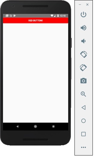
Facebook offers the Button component, which can be used as a generic button. Consider the following example to understand the same.
App.js
import React, { Component } from 'react'
import { Button } from 'react-native'

const App = () => {
   const handlePress = () => false
   return (
      <Button
         onPress = {handlePress}
         title = "Red button!"
         color = "red"
      />
   )
}
export default App
If the default Button component does not suit your needs, you can use one of the following components instead.
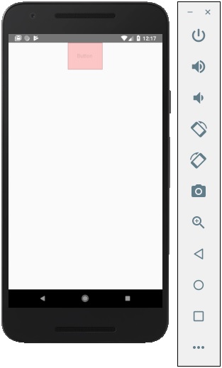
Touchable Opacity
This element will change the opacity of an element when touched.
App.js
import React from 'react'
import { TouchableOpacity, StyleSheet, View, Text } from 'react-native'

const App = () => {
   return (
      <View style = {styles.container}>
         <TouchableOpacity>
            <Text style = {styles.text}>
               Button
            </Text>
         </TouchableOpacity>
      </View>
   )
}
export default App

const styles = StyleSheet.create ({
   container: {
      alignItems: 'center',
   },
   text: {
      borderWidth: 1,
      padding: 25,
      borderColor: 'black',
      backgroundColor: 'red'
   }
})
Touchable Highlight
When a user presses the element, it will get darker and the underlying color will show through.
App.js
import React from 'react'
import { View, TouchableHighlight, Text, StyleSheet } from 'react-native'

const App = (props) => {
   return (
      <View style = {styles.container}>
         <TouchableHighlight>
            <Text style = {styles.text}>
               Button
            </Text>
         </TouchableHighlight>
      </View>
   )
}
export default App

const styles = StyleSheet.create ({
   container: {
      alignItems: 'center',
   },
   text: {
      borderWidth: 1,
      padding: 25,
      borderColor: 'black',
      backgroundColor: 'red'
   }
})
Touchable Native Feedback
This will simulate ink animation when the element is pressed.
App.js
import React from 'react'
import { View, TouchableNativeFeedback, Text, StyleSheet } from 'react-native'

const Home = (props) => {
   return (
      <View style = {styles.container}>
         <TouchableNativeFeedback>
            <Text style = {styles.text}>
               Button
            </Text>
         </TouchableNativeFeedback>
      </View>
   )
}
export default Home

const styles = StyleSheet.create ({
   container: {
      alignItems: 'center',
   },
   text: {
      borderWidth: 1,
      padding: 25,
      borderColor: 'black',
      backgroundColor: 'red'
   }
})
Touchable Without Feedback
This should be used when you want to handle the touch event without any animation Usually, this component is not used much.
<TouchableWithoutFeedback>
   <Text>
      Button
   </Text>
</TouchableWithoutFeedback>